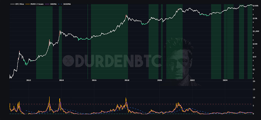
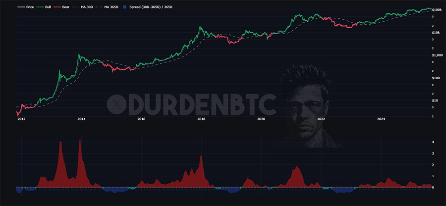
LTH MVRV Z • Heat & Trend
Tracks profit stress on long-term holders and flips regimes using 30D vs 365D trend. Green = trend up, pressure easing. Red = distribution vibes.
The goal is simple: cut through noise, decode cycles, and give you a framework to navigate volatility with precision.
Every chart here ties back to the same foundation: liquidity, flows, and behavioral patterns that drive Bitcoin’s regime shifts. This isn’t speculation dressed as analysis. It’s a toolkit for reading the market in real time.
A curated set of high-signal dashboards that map Bitcoin’s cycle—FRED-based macro, liquidity (M2, Net Liquidity), dollar & rates, credit spreads, risk breadth, and on-chain metrics. Each card opens a focused, one-chart page with regime shading and plain-English notes. Clean, fast, updated daily.
Tracks profit stress on long-term holders and flips regimes using 30D vs 365D trend. Green = trend up, pressure easing. Red = distribution vibes.
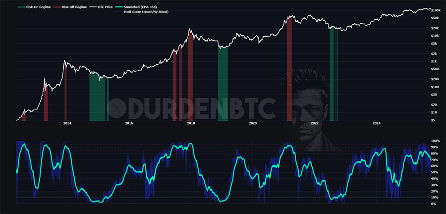
This optimized Puell Multiple converts miner revenue pressure into a standardized score, blending epoch and four-year windows so today’s readings are comparable to prior cycles.
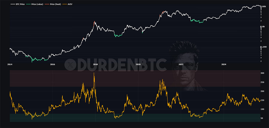
A flow-of-funds lens for Bitcoin. AVIV contrasts on-chain capital in motion with investors’ aggregate cost basis, highlighting frothy phases vs washed-out opportunity.
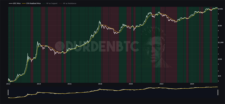
Simple, brutal, effective: above STH realized price = expansion; below = risk-off. Regime shading updates in real time.
Green when 30D > 365D, red when not. Early-Bull flags the inflection as the 365D turns higher — no hero trades, just trend.
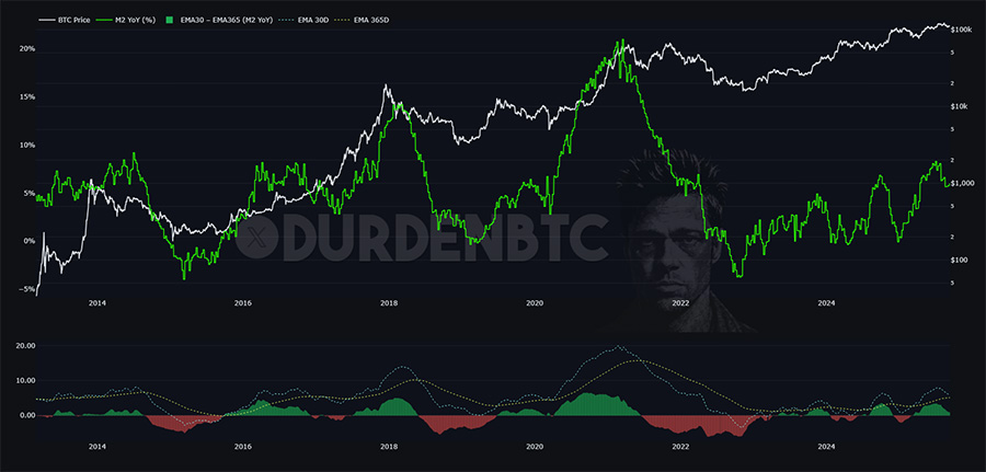
Year-over-year change in global money supply (M2) plotted against Bitcoin. Rising liquidity growth tends to support Bitcoin uptrends, tightening cycles often align with drawdowns.
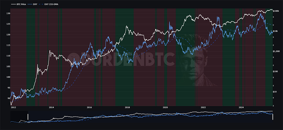
Rising dollar = headwind, falling dollar = tailwind. We track the USD’s 233-DMA trend: uptrend = risk-off, downtrend = risk-on for BTC.
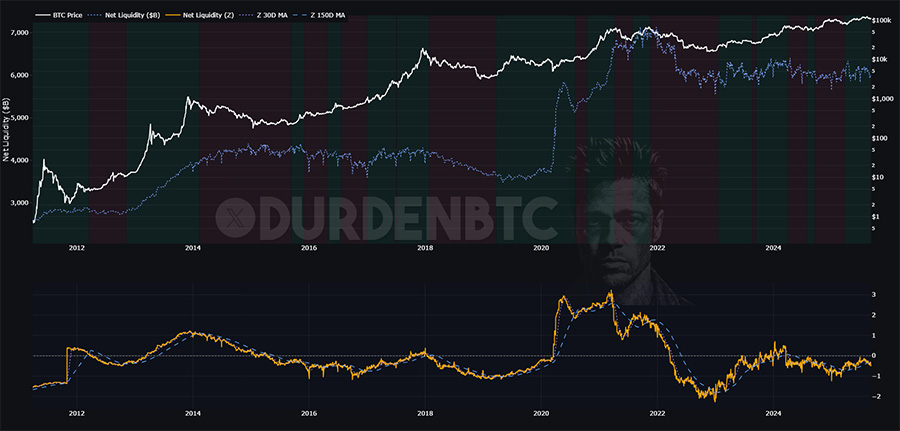
WALCL – TGA – RRP normalized and z-scored (Δ365). BTC on top, liquidity Z on bottom. Background flips green when Z-30D > Z-150D (easing), red when not (tightening).
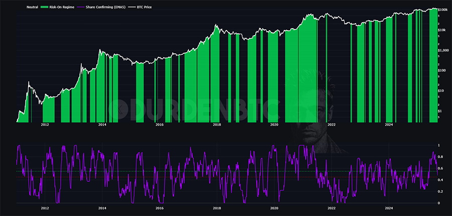
FRED-driven cross-asset breadth that classifies Risk-On vs Risk-Off. Components SPX, HY OAS, VIX & 7 others confirm when their 55-day trend improves. 🚧 Under construction.
Auto-refreshed every 12h from bank research & major financial outlets. Focus: ISM, DXY, inflation, liquidity (Fed/Treasury/RRP/TGA), policy (Fed/BOJ/PBOC), credit, energy, and sentiment — only what moves Bitcoin. To see all relevant news stories, please click here.
No items match your filters (try clearing search/topic).
This bulleted list covers what I'm working on next so you always have something to look forward to. The work never stops, all alpha decays. We must fight to stay ahead of the herd.